The easiest sale you will ever get, until your site throws it away
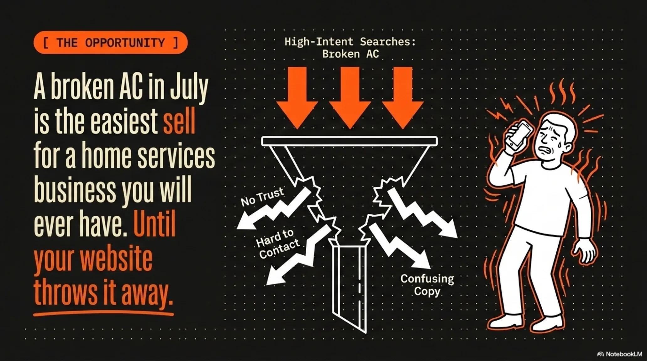
A broken AC in July is the easiest sale a home services business will ever make. The homeowner is hot, stressed, and ready to pay today. They are not comparison shopping for fun. They typed “AC repair near me” with sweat on their phone screen, and the first company that looks safe and easy to book wins the job.
Then most contractor websites throw that job away. The visitor lands and cannot tell what the company actually does. There is no proof anyone trustworthy runs the place. The phone number is buried three clicks deep. The copy talks about “comfort solutions” instead of fixing the AC today. Every one of those problems sends a ready-to-buy homeowner back to Google, where your competitor is one tap away.
This is the exact structure that keeps that from happening on your site. It is the same structure I walk through live on camera and build for the operators I work with, and you can click through a working demo site built this exact way. None of it requires a redesign agency or a five-figure budget. It requires putting the right things in the right order.
Pass the 3-second test

A panicked homeowner does not read your website. They scan it. If they cannot answer three things in three seconds, they hit the back button and call the next contractor. The part of the page visible before anyone scrolls is called above the fold, and it has to carry all three facts:
- What you do, the specific service. “AC repair and installation,” not “your comfort is our mission.”
- Where you do it, your service area, named. “Serving Phoenix and the West Valley,” not “serving the local area.”
- The outcome, the result they want, stated plainly. “Fixed today.”
Run the test on your own site right now. Open your homepage on your phone, hand it to someone who has never seen it, and take it back after three seconds. If they cannot repeat what you do, where you do it, and what they get, the page is failing before a single line of copy gets read. This is not a design opinion. It is how a stressed buyer behaves when their house is 95 degrees.
The fix usually fits in one headline and one subline. Service plus city plus outcome. Everything else on the page exists to support those three facts, not to compete with them.
Use a sticky header with a hard CTA and a soft CTA
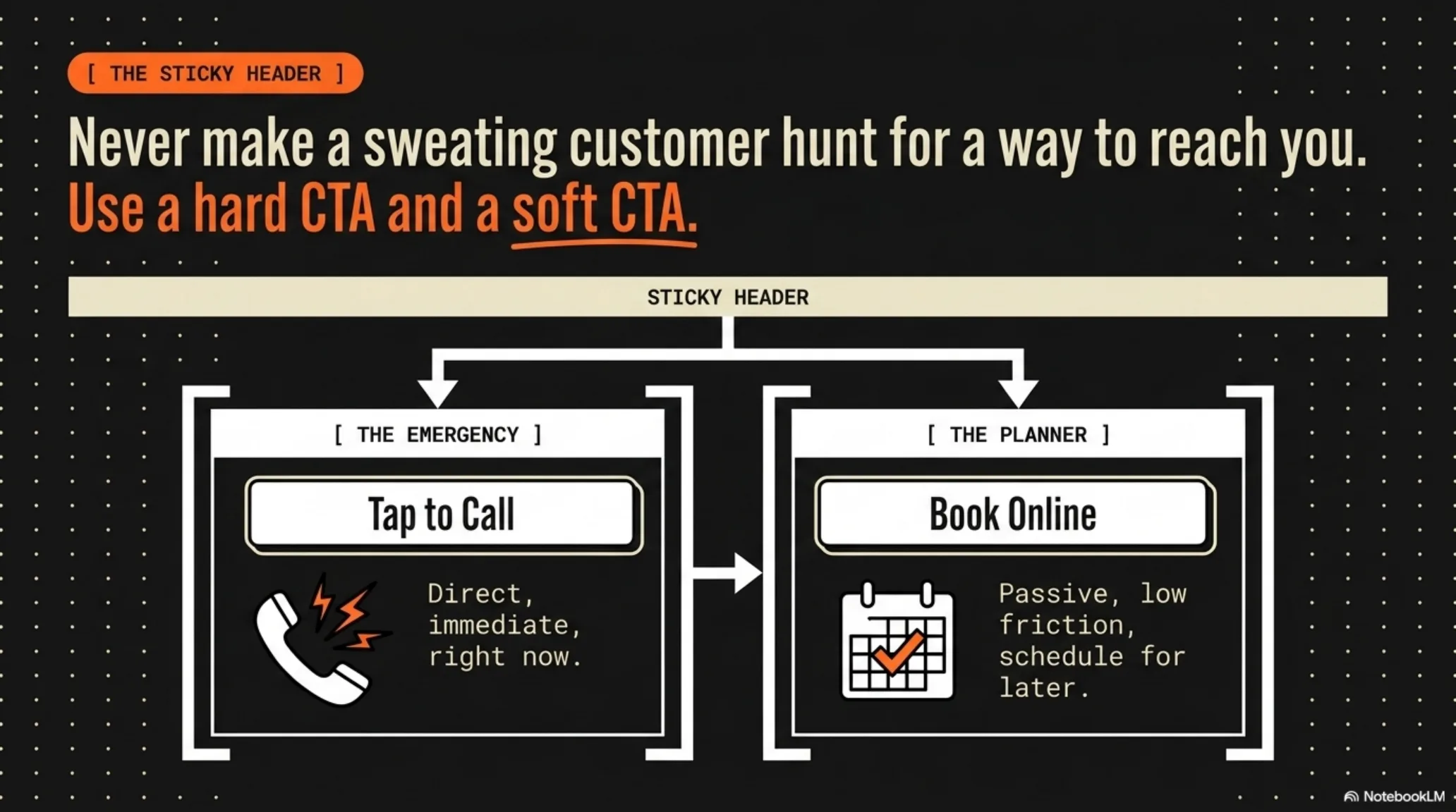
Never make a sweating customer hunt for a way to reach you. A sticky header is the navigation bar that stays pinned to the top of the screen while the visitor scrolls, so the way to book is always one tap away no matter how far down the page they are. Give it two buttons, because you have two kinds of buyers:
- The hard CTA: tap to call. For the emergency. Direct, immediate, right now. On mobile it dials your shop in one tap, no copying a number, no hunting a contact page.
- The soft CTA: book online. For the planner. Low friction, no phone call, schedule for later. This captures the buyer who is ready to commit but does not want to talk to anyone yet.
Most contractor sites offer only one path, and it is usually the phone number. That works for the emergency caller and silently loses the planner, the person researching at 10 PM who is not going to call anyone tonight but would happily pick a Tuesday slot from a calendar. Running both buttons means you stop losing the half of your traffic the other button would have missed.
One more mobile detail that costs jobs: make the call button an actual tel: link and test it on a real phone. A phone number that does not dial when tapped is a leak you will never see in your analytics.
Build a trust bar above the fold
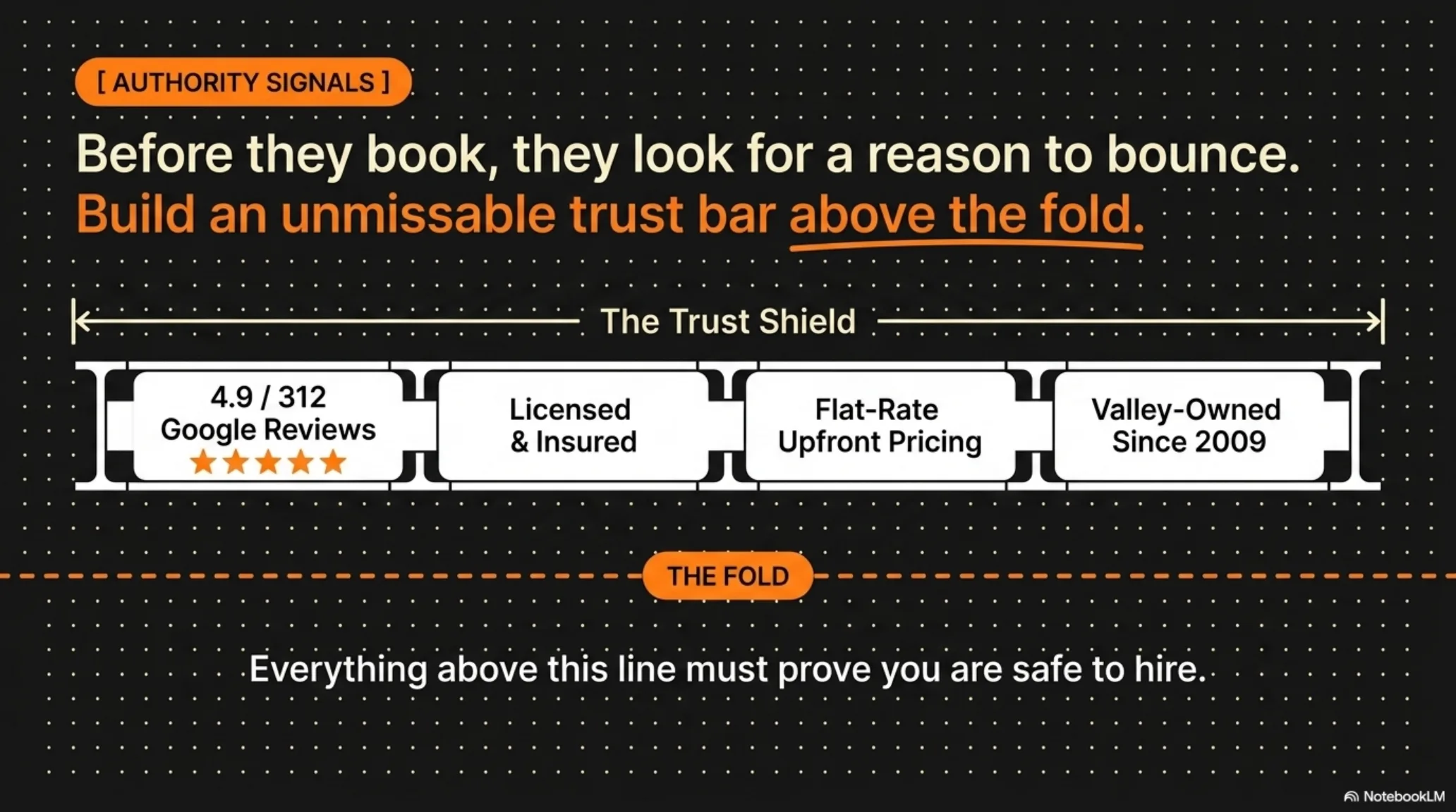
Before anyone books, they look for a reason to bounce. Trust is the only thing that lets a stranger invite your technician into their home, and they decide on it fast, before they ever scroll to your reviews page. Put an unmissable trust bar above the fold and prove you are safe to hire before you ask for anything. Load it with your real authority signals:
- Your Google rating and review count, next to the actual Google logo people already trust. Use your own numbers, not placeholders, and keep them current.
- Licensed and insured, stated plainly. Homeowners are trained to look for it, so do not make them ask.
- Flat-rate, upfront pricing, so they know you will not pull something slick on them once you are in the door.
- Years in business. “Family-owned since 2009” reads as “we will still exist when the warranty matters.” Longevity is reliability.
Everything above that line exists to answer one silent question: are you safe to hire. Answer it before you ask for the click, and the click gets a lot easier.
Remind them what waiting costs
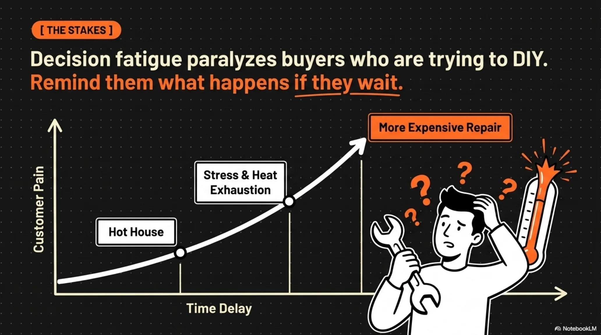
Decision fatigue paralyzes buyers. A homeowner with a dead AC dreads the cost, the time, and the hassle, so they stall. They try to DIY it off a YouTube video. They call a relative who “knows HVAC” to save a buck. They tell themselves it might cool off this weekend. Your site has to make the cost of waiting feel heavier than the cost of calling you.
Spell out what “wait and see” actually buys them: a hotter house tonight, a family sleeping in the living room, and a small failure grinding itself into a big one. A capacitor problem ignored becomes a compressor problem, and the repair bill grows with it. You are not just fixing a machine. You are stopping a bad afternoon from becoming a disaster, and your copy should say so in plain language.
This is not fear-mongering. It is the truth a stalled buyer needs to hear to act in their own interest. Put it right before your booking section, where the hesitation actually happens.
Show exactly three steps to the outcome
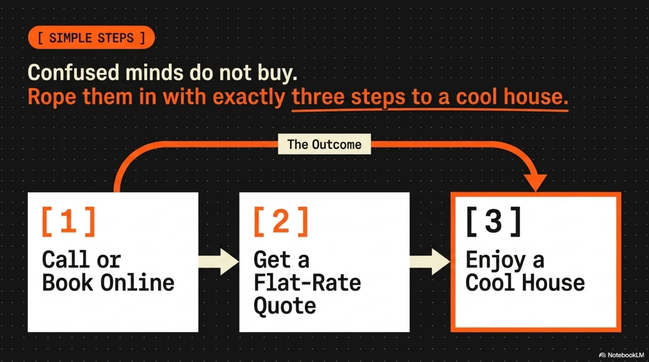
Confused minds do not buy. If hiring you looks like a process with unknown steps and unknown costs, the stressed buyer defaults to doing nothing. Lay out the path in exactly three steps so hiring you looks effortless:
- Call or book online. Thirty seconds, either button.
- Get a flat-rate quote. Upfront pricing before any work starts, no hidden fees, no surprises on the invoice.
- Enjoy a cool house. From a hot, broken home to a comfortable one, usually the same day.
Three steps, not five, not seven. Each one starts with an action word, and the last one is the outcome they actually want, not a process step. The buyer should be able to see the whole journey from where they are standing to a cool living room. That visibility is what pulls a stalled buyer over the line.
Prove the neighbors already trust you
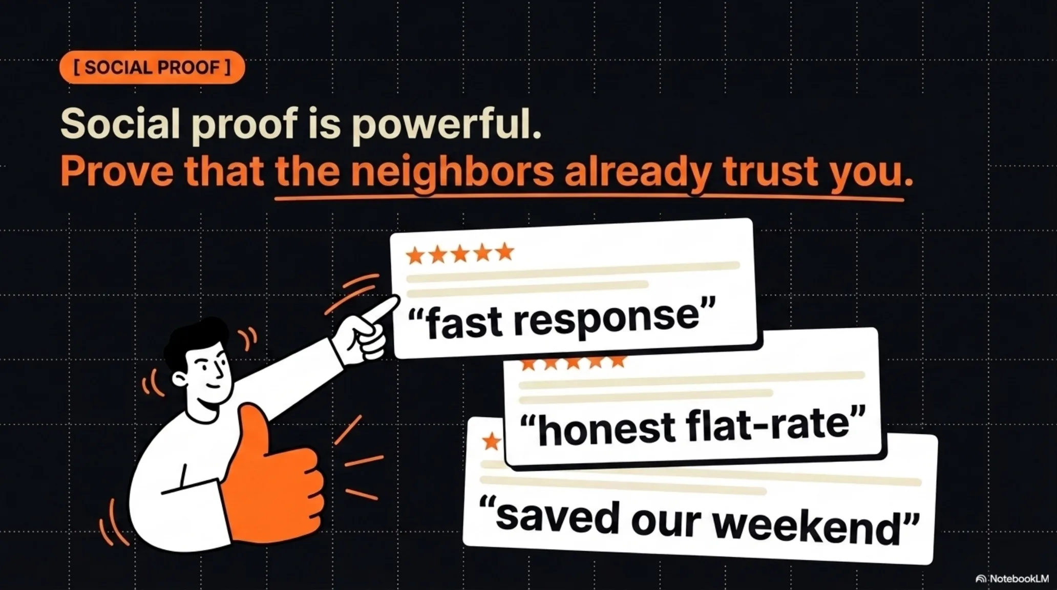
Social proof is powerful because it moves the decision off your word and onto your customers’. You saying “we’re reliable” is marketing. A neighbor saying “they showed up in an hour” is evidence.
Pull short, specific review snippets and put them where buyers hesitate, next to your pricing, next to your booking button: “fast response,” “honest flat-rate,” “saved our weekend.” Specific beats glowing. A three-word real quote outperforms a paragraph of marketing copy, because it sounds like a person instead of a brochure. Rotate in fresh ones as they come in so the proof never looks stale.
Write FAQs that AI answer engines can cite
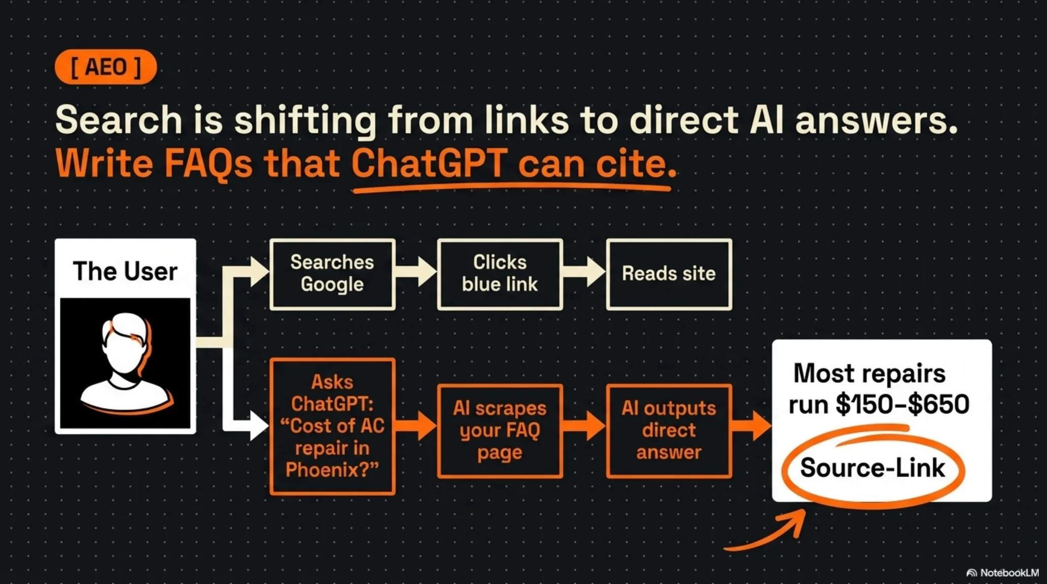
Search is shifting from a list of blue links to a single direct answer. More of your buyers now ask ChatGPT or Google’s AI overview a question like “how much does AC repair cost in Phoenix” and read the answer without ever clicking a website. That sounds like bad news for your traffic, and it is, unless you are the source the AI cites.
If your FAQ page answers the question cleanly, the AI scrapes it, gives the answer, and names you. Write your FAQ in plain question-and-answer form, with the real answer stated in the first sentence, not buried after three sentences of throat-clearing. Cover the questions buyers actually ask: what it costs, whether you handle emergencies, how fast you can come, why they should trust you. Real numbers and real commitments get cited. Vague marketing does not.
This is the same reason this article opens with a direct answer instead of a warm-up paragraph. Answer first, explain second. That is how you get named when the search never becomes a click.
Catch the ones who are not ready yet
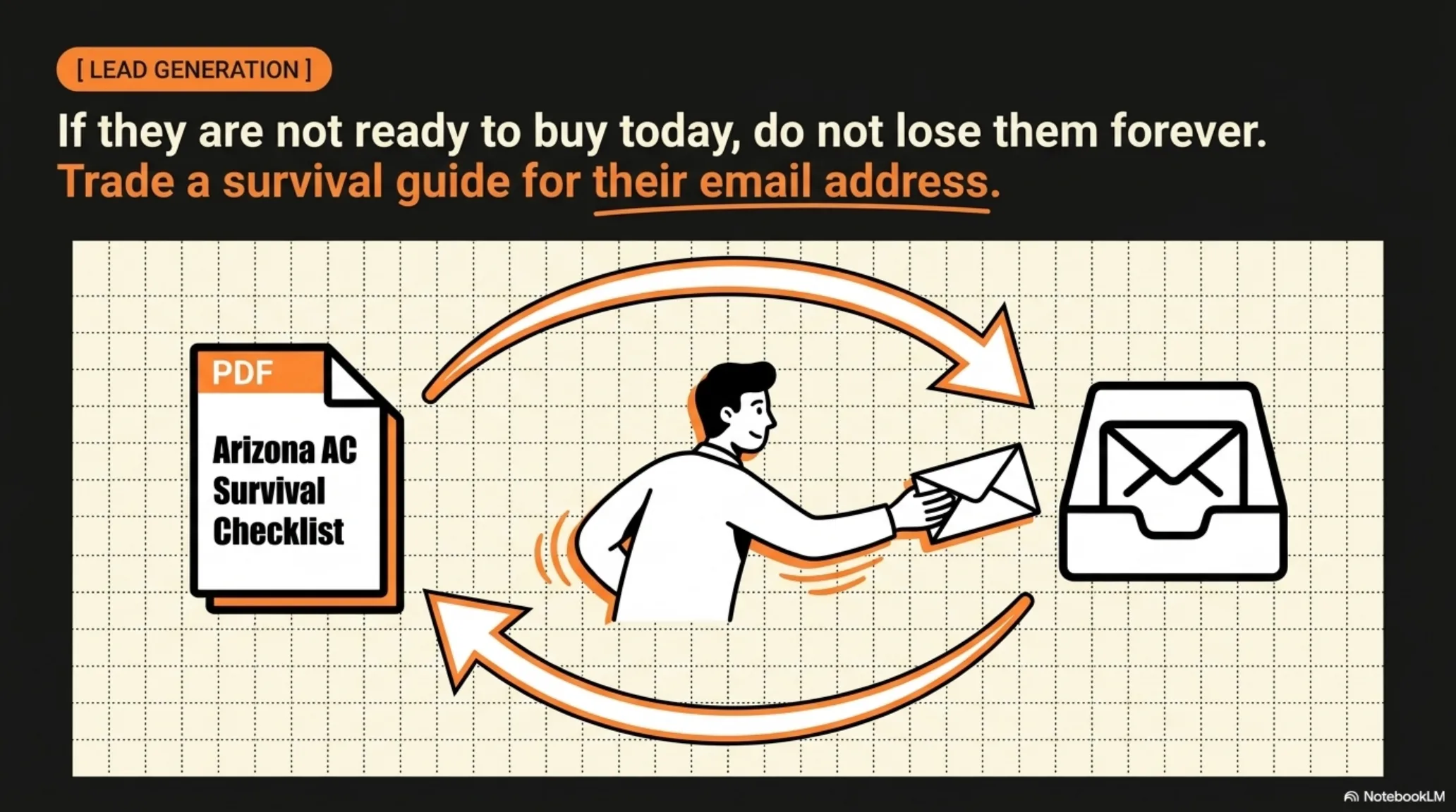
Not everyone who lands on your site is ready to book this second. Some are researching for next month. Some are checking prices for a parent. If they leave without giving you anything, they are gone, and you paid for that visit whether it came from ads or effort.
Trade something useful for an email. A free “Arizona AC Survival Checklist,” a maintenance guide, a what-to-do-during-a-blackout one-pager. The visitor gets real value, you get permission to follow up, and a buyer who was not ready today becomes a booked job in three weeks when the unit finally quits. One good lead magnet quietly compounds while the rest of the site handles the emergencies.
Put it in this order and stop guessing
Structure is the whole game. Top to bottom: the three-second answer, the sticky header with both CTAs, the trust bar, the stakes, the three steps, the proof, the FAQ, the lead magnet. Every section either builds trust or removes friction, and nothing on the page is decoration. Want to see it assembled? Walk through the live demo site built section by section with this exact playbook.
If you want to see what fixing the structure is worth in dollars before you touch anything, run the Missed Call Revenue Calculator. And remember the website is only half the leak: a site this good still loses the job if nobody answers the phone it makes ring. That is why the other half matters — every missed call should get a text back in under a minute, so the homeowner who just hung up on your voicemail replies to you instead of dialing the next shop on the list.
Frequently asked questions
What is the single most important thing on an HVAC homepage?
The three-second test. Above the fold, a visitor has to see what you do, where you do it, and the outcome they get. If those three facts are not obvious in three seconds, nothing else on the page matters because the visitor is already gone.
Should my HVAC site have a “call now” button or an online booking form?
Both. Put a hard CTA (tap to call) for the emergency buyer and a soft CTA (book online) for the planner who does not want to talk yet. Running only one loses whichever half of your traffic prefers the other.
Why do I need a trust bar if I already have good reviews?
Because buyers decide whether you are safe to hire in the first few seconds, before they scroll to find the reviews. A trust bar above the fold puts your rating, license, and flat-rate pricing in front of them immediately, at the exact moment they are looking for a reason to leave.
What is AEO and does it matter for a local HVAC company?
AEO is answer engine optimization: structuring your content so AI tools like ChatGPT and Google’s AI overview quote you directly. It matters because a growing share of buyers get their answer from the AI and never click a website. A clean FAQ page is how a local company gets cited instead of skipped.
How long does it take to restructure an existing HVAC website this way?
Days, not months. This is a structure change, not a rebuild: rewrite the above-the-fold headline, pin a sticky header with both CTAs, add the trust bar, reorder the sections, and rewrite the FAQ in answer-first form. Most of the win comes from the top of one page.
Do my website colors have to match my trucks and uniforms?
Yes, and the mismatch costs more than it sounds like it should. A homeowner who sees one set of colors on your site and a different set on the truck in their driveway notices before they can put words to it, and it reads as a shop that is not quite put together. Matching the site, the truck, the invoice, and the shirt is most of what makes a three-truck operation look established. Pick one set of colors and use it everywhere.
Should my website explain how the repair works, or just sell the job?
Explain some of it. A short page that tells a homeowner why a coil freezes up or what is really behind a room that never cools makes you the person who taught them something instead of one more company asking for the job. That is usually the shop they call. It also gives answer engines something worth quoting. Keep it plain and keep it short — you are building trust before the truck shows up, not writing a manual.
Keep going
Structure is one piece — see how the full system fits together in Websites That Book Jobs, and compare your options in what a website costs in 2026.