A five-figure yard is won or lost on a webpage

Landscaping is a trust purchase. A homeowner is about to let strangers tear up their yard and hand over five figures, so they do not call the first company they find. They open three or four websites, spend a few seconds on each, and the site that looks the safest and easiest to book gets the design visit. The other sites never hear the phone ring and never know why.
This is the structure that wins that comparison. It is the same structure I build live on camera, and you can click through a working landscaping demo site built this exact way, section by section, with a teaching note pinned to every piece. None of it requires a five-figure agency retainer. It requires putting the right things in the right order.
Pass the 3-second test

A visitor decides whether to stay on your site before they scroll and before they read. The part of the page visible without scrolling has to answer three questions instantly:
- What you do, the specific service. “Landscape design and installation,” not “transforming outdoor spaces.”
- Where you do it, your cities, named. “Scottsdale, Phoenix, and Paradise Valley,” not “the local area.”
- The outcome, the thing they actually want. A backyard they love instead of a gravel lot they avoid.
On the demo site the headline reads “Landscape Design & Installation in Scottsdale,” and the line under it sells the finished yard, not the company. The visitor is the hero of the page; the company never talks about itself first. There is a bonus hiding in that headline too: it carries the exact phrase a buyer types into Google, which is the cheapest search ranking help you will ever get.
Give them two ways to say yes
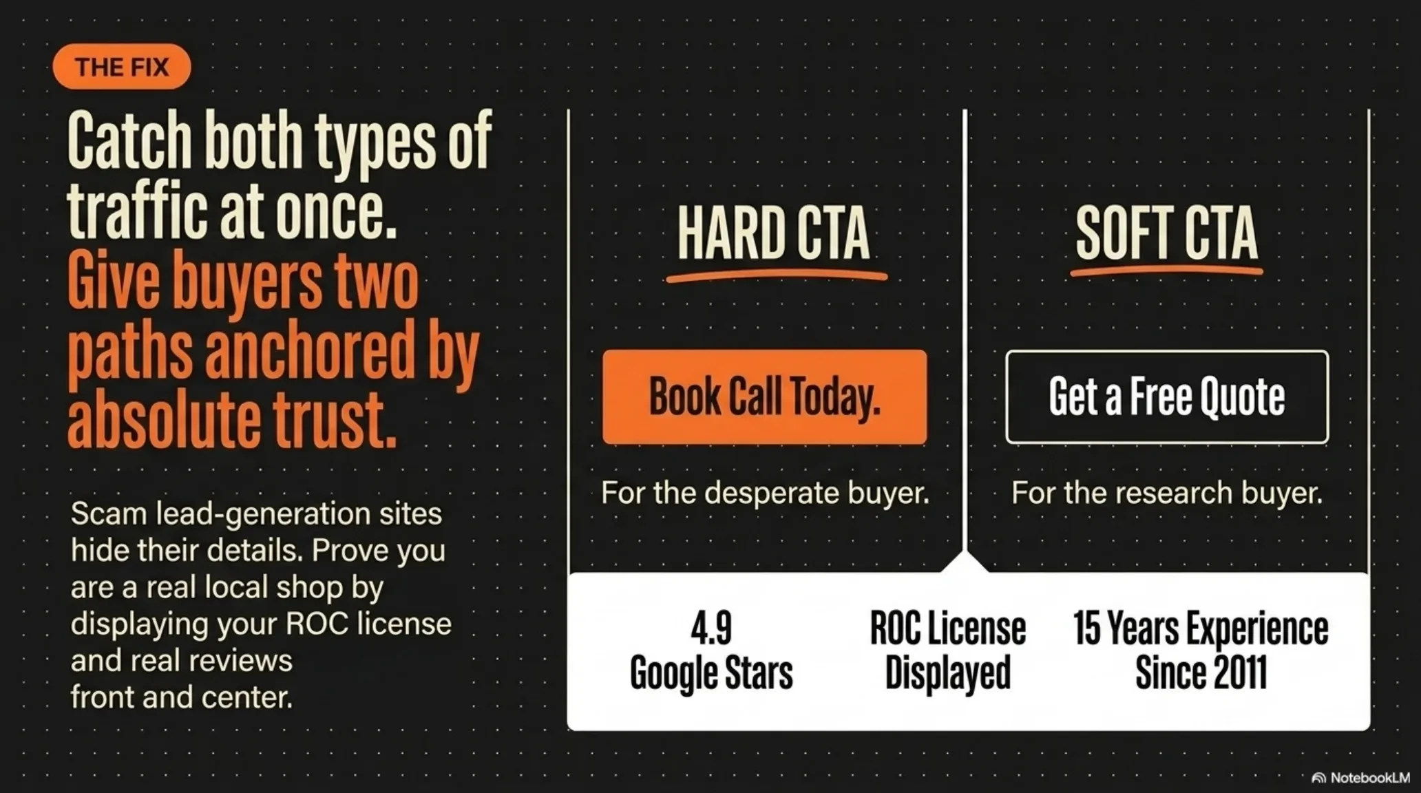
Half your visitors will never make a phone call. The homeowner scrolling at 9pm from the backyard they are mad at is not going to talk to anyone tonight, but they would happily book a free design visit from a calendar. The retiree who wants to describe the project out loud wants a number to dial. Run both, always visible:
- The hard ask: tap to call. For the buyer who is ready to talk right now. On a phone it should dial in one tap.
- The soft ask: book a free design visit. For the researcher who is not ready to talk. A short form, three fields at most, because every extra field costs you leads.
Pin both buttons in a sticky header, the bar that stays at the top of the screen as the visitor scrolls. The moment they decide is rarely the moment they land, and the sticky header means the way to book is one tap away whenever that moment arrives.
Settle the fear before you pitch
Before a homeowner books, they are looking for a reason to leave. Trust objections lose more landscaping jobs than price does, because the fear is specific: the bid that triples mid-job, the crew that vanishes for two weeks, the “design” that turns out to be a napkin sketch. A trust bar above the fold answers that fear with proof instead of adjectives:
- Your Google rating and review count, your real numbers, next to the Google mark people already trust.
- Your ROC license number, licensed, bonded, and insured, stated plainly. In Arizona this is what separates a real shop from the lead-harvesting sites that impersonate one.
- Fixed prices. The bid you sign is the bill you pay. For a five-figure yard project this one line does more selling than a photo gallery.
- Years in business. “Valley-owned since 2011” reads as “we will still be here when the warranty matters.”
Every item is a checkable fact, not a slogan. That is the difference between claiming trust and proving it.
Name what waiting costs
A landscaping buyer can stall forever, because an ugly yard is not an emergency. Nothing is leaking, nothing is broken, so “next spring” always feels reasonable. Your site has to make the cost of doing nothing visible. The demo site does it with three honest stakes: curb appeal moves what buyers and appraisers think the whole house is worth, a clogged $6 drip line can quietly cost thousands in dead plants in desert heat, and every weekend spent fighting the yard is a Saturday that never comes back.
This is not scare copy; it is the truth a stalled buyer needs to act in their own interest. One honest section on the cost of inaction creates urgency without hype, and almost no landscaping site bothers to include it.
One service, one page
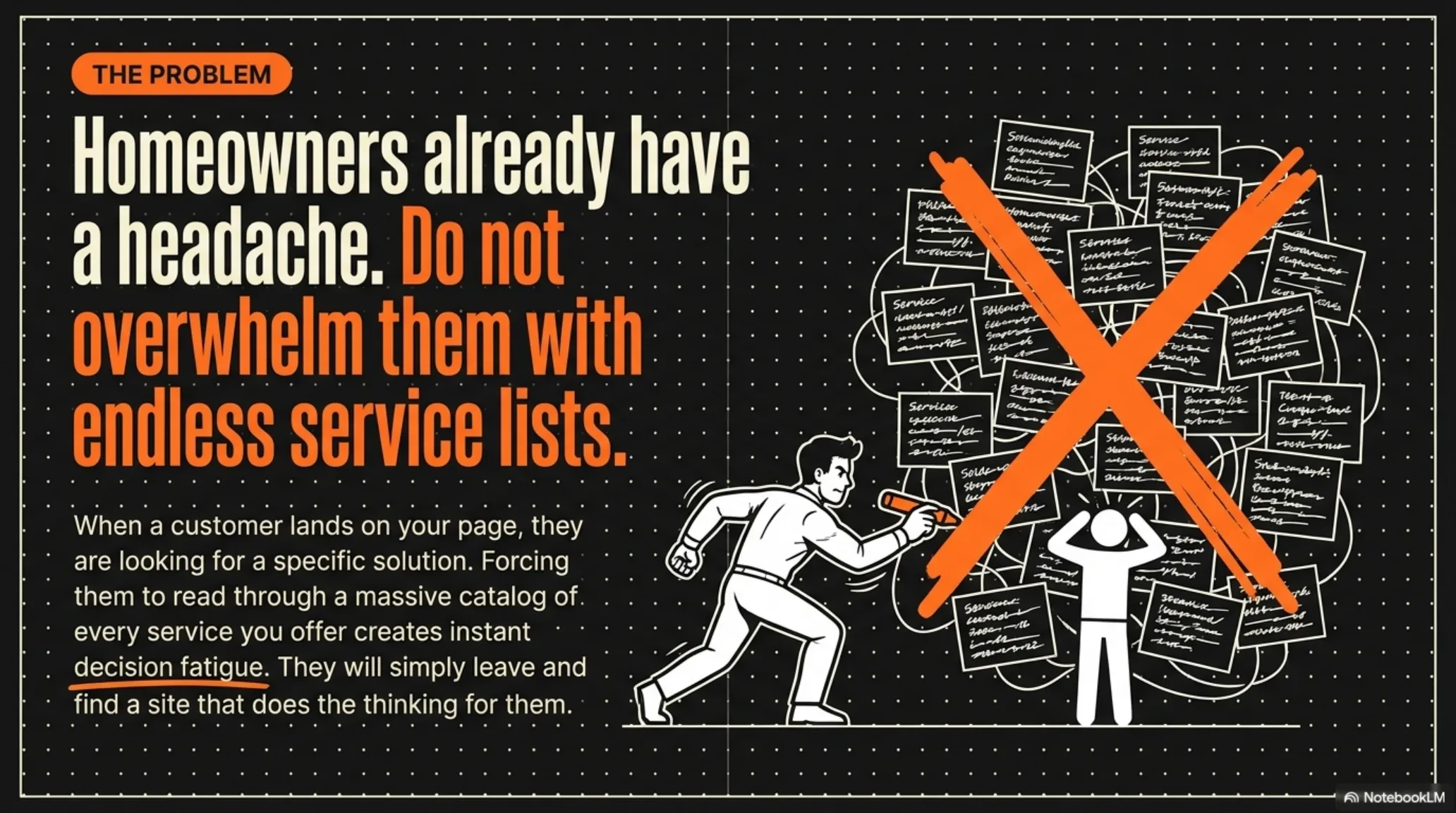
Here is the mistake that quietly caps most landscaping companies on Google: one page trying to rank for six services ranks for none of them. Artificial turf, paver patios, irrigation repair, cleanups, tree care, full design and install. Each of those is its own search with its own buyer, and Google matches searches to pages, not to companies.
So the services section of your homepage should be a menu of doors: each service gets a card, and each card links to its own dedicated page targeting that one search, like “artificial turf Scottsdale” or “paver patio Phoenix.” The same logic applies to the cities you serve. Google cannot rank you for a city that never appears on your site, so name your service areas in the page itself, and keep them matching your Google Business Profile exactly. This is the single biggest local search lever a landscaping site has, and it costs nothing but the pages.
Empathy, then a three-step path
Expertise proves you can do the work; empathy proves you know what hiring a landscaper feels like from the homeowner’s side of the fence. One line that says “we know, the bids triple and the crews vanish,” backed by your years in the local climate, does more than a page of credentials. You are not a contractor with a truck; you are the operator who knows what the desert does to plants and what it takes to make a yard survive it.
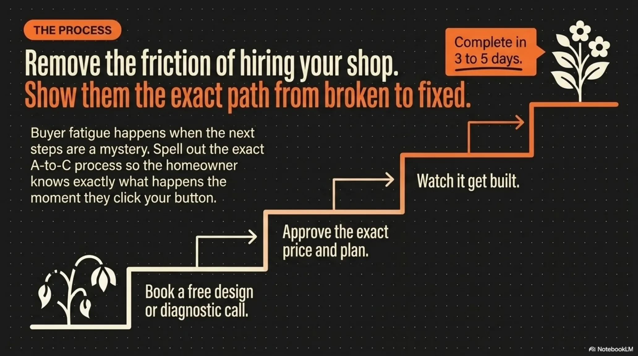
Then remove the last piece of friction: the buyer’s quiet worry about what actually happens after they reach out. Answer it with exactly three steps:
- Book a free design visit. A short visit in the yard. They talk, you measure, no obligation.
- Approve the design and the price. A real plan and one fixed bid, changed as much as they want before work starts.
- Watch it get built. Most yards done in days, cleaned up, guaranteed.
Three steps, small enough to fit on a sticky note. Confused visitors do not buy, and the three-step plan is how a big scary project starts looking easy.
Show reviews with numbers in them
“Great service, five stars” convinces nobody, because anyone can write it. A believable review has a name, a city, and a number in it. “Quoted $8,400, final bill $8,400” is the demo site’s example, and notice what it does: it re-proves the fixed-price promise the page already made, in a customer’s voice instead of the company’s.
Pull your best real Google reviews onto the site and put them next to the places people hesitate: beside the booking form, beside the pricing talk. Specific beats glowing, every time.
Write answers engines can lift
A growing share of your buyers never see a list of links at all. They ask ChatGPT or Google’s answer box “how much does landscaping cost in Scottsdale” and read one direct answer. The sites that get named in that answer are the ones that already answered the question cleanly: a direct question as the heading, then two or three sentences with real numbers, no throat-clearing.
That is exactly how the FAQ on your site should read. What projects cost in your market, how long an install takes, whether you handle HOA approval, whether you are licensed. Blunt answers with real figures get quoted; vague marketing gets skipped. It is also why this article opens with a direct answer instead of a warm-up paragraph.
Put it in this order and stop guessing
Structure is the whole game. Here is the full page, top to bottom, and the one job each section does:
| Section | The job it does |
|---|---|
| Sticky header: call + book | The way to say yes is always one tap away |
| 3-second headline | What you do, where, and the yard they get |
| Trust bar | Rating, license, fixed prices; settles the fear |
| Stakes | Makes the cost of waiting visible |
| Service cards, one page each | Each service wins its own search |
| Empathy + three steps | Makes a five-figure project feel easy |
| Reviews with numbers | Proof in the customer’s voice |
| Answer-first FAQ | Gets you quoted by answer engines |
| Free guide for the not-yet-ready | Captures the buyer who says “next spring” |
Two notes on that last row. A free guide, something genuinely useful like which plants survive brutal summers, turns a visitor who was not ready today into a booked design visit in three months. And it goes after the booking ask, never before it, because you do not hand people an exit ramp before you have made the offer.
Want it assembled? Walk through the live demo site built with this exact playbook. And remember the website is only half the leak: the average home-service business misses 30 to 40 percent of its calls, and the best landscaping site in Arizona books nothing if the call it generates hits voicemail. Run the Missed Call Revenue Calculator to see what that half is costing you before you touch a line of your website.
Frequently asked questions
What should be above the fold on a landscaping website?
Three things, readable in three seconds: what you do (the specific services), where you do it (your cities, named), and the outcome the homeowner gets (a yard they love). Add a visible trust bar and both a call button and a booking button. If a visitor has to scroll or think to find any of that, the page is losing jobs.
Do landscaping websites need online booking, or is a phone number enough?
You need both. A phone number alone silently loses the half of your visitors who will not make a call, especially younger homeowners browsing at night. A short booking form, three fields at most, captures them. Keep both options pinned in a sticky header so they follow the visitor down the page.
Should every landscaping service get its own page?
Yes. Google ranks pages, not companies, and one page chasing six services ranks for none of them. A dedicated page for artificial turf, another for paver patios, another for irrigation repair lets each page own its own search in your city. It is the biggest local search lever a landscaping site has.
Why do reviews need names and dollar amounts?
Because specificity is what makes proof believable. “Great work, five stars” could be written by anyone. A review with a first name, a city, and a real figure, like a final bill that matched the quote, reads like a neighbor talking and re-proves the exact promises your page makes. Pull your best real Google reviews onto the site and keep them current.
I already have a landscaping website. Is it worth restructuring instead of rebuilding?
Usually yes, and it is days of work, not months. Most of the win lives at the top of one page: rewrite the headline to pass the 3-second test, pin a sticky header with a call button and a booking button, add a trust bar, and break your services into their own pages. The content underneath can stay; the order and the top of the page are what change the results.
Keep going
Structure is one piece. See how the full system fits together in Websites That Book Jobs, and compare your options in what a website costs in 2026.